FRANKLIN TEMPLETON’S OUR FUNDS
Recognizing Simplicity and Adding Elements of Delight
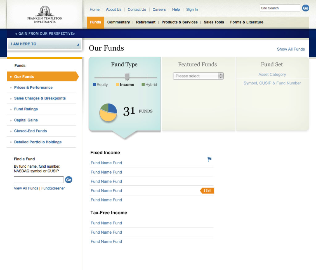
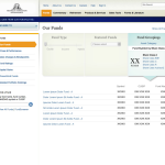
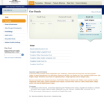
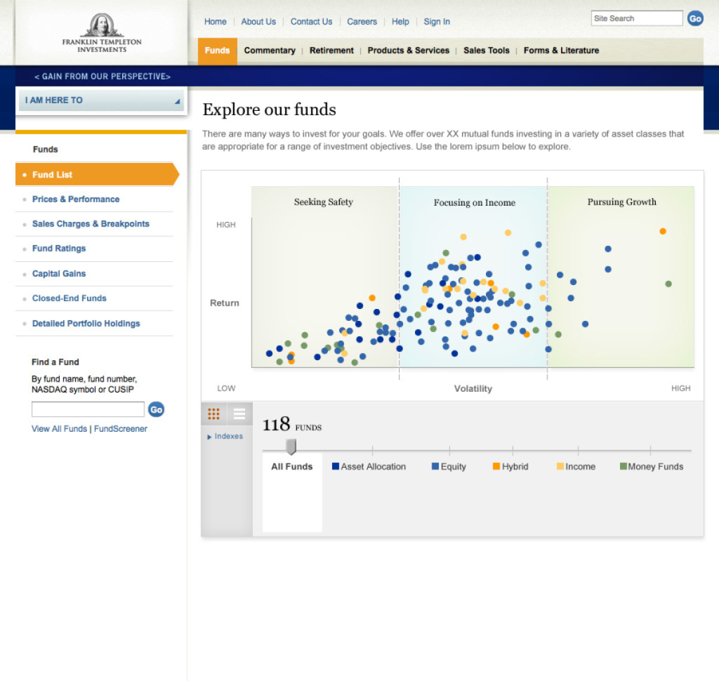
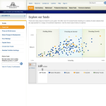
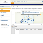
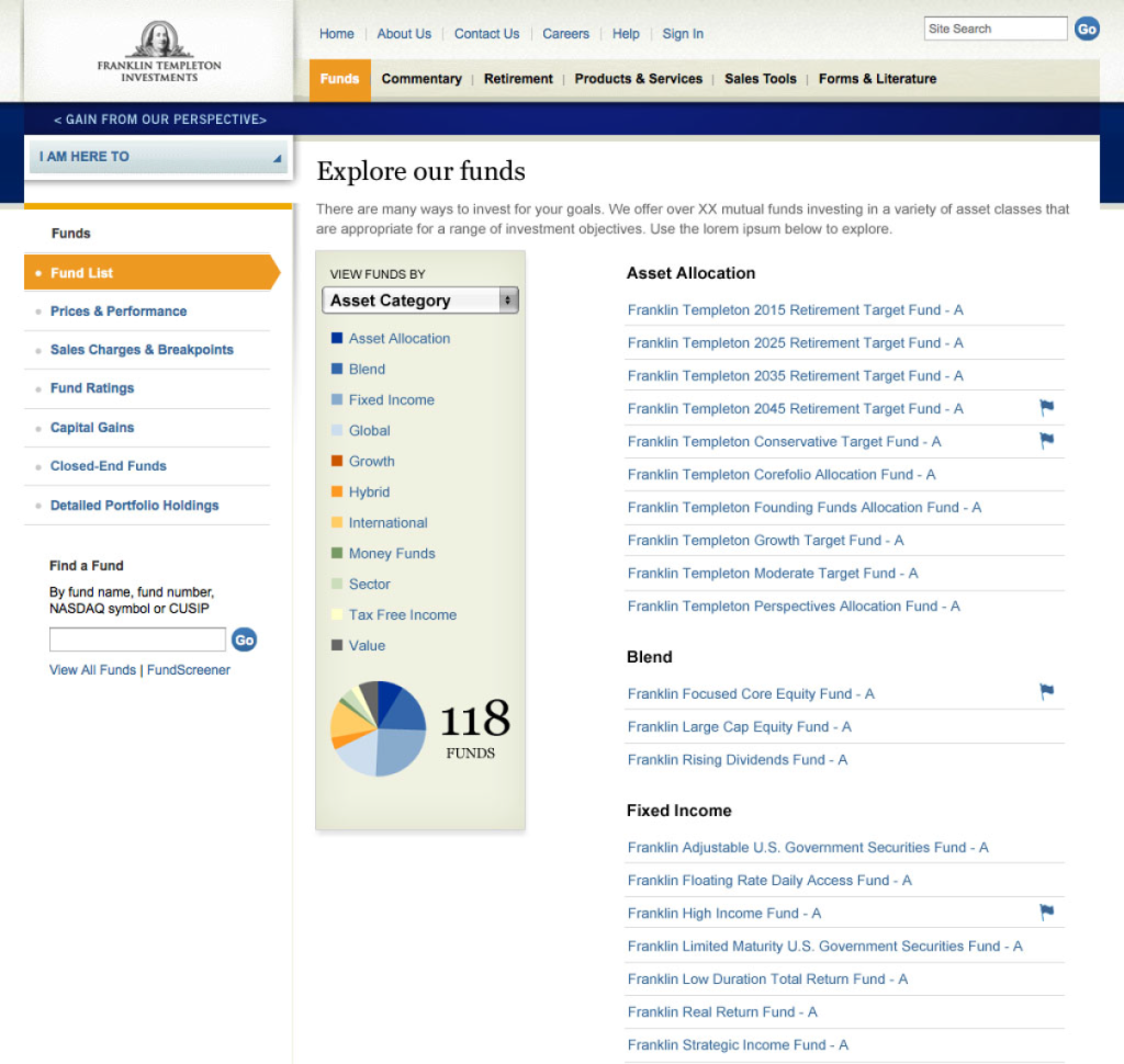
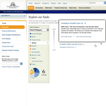
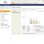
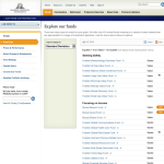
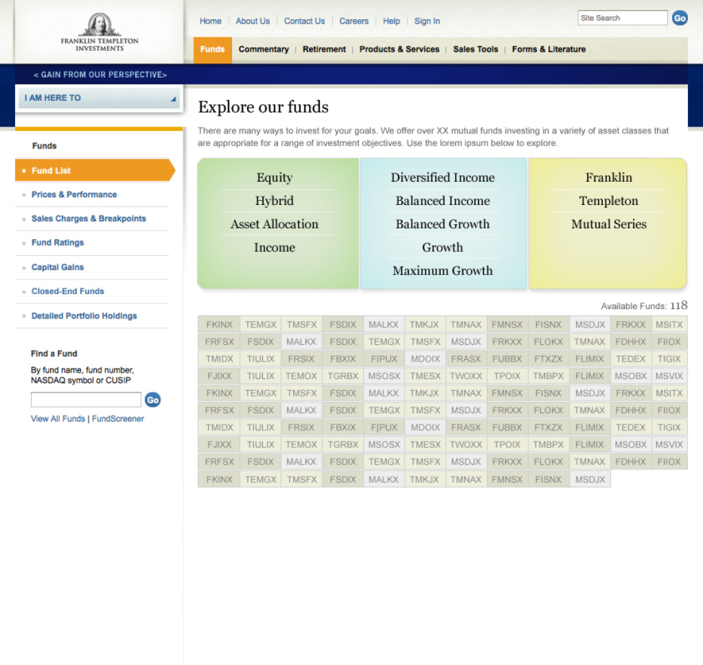
Franklin Templeton offered over 115 unique funds. While the breadth of options was a core reason financial advisors sold Franklin funds, many were overwhelmed when it came to learning about them. The financial advisors needed a simple way to not only quickly sort through the company’s 118 funds, but find ones that matched the key attributes they desired. From the business side, the company was looking for a new and innovative way to showcase the depth and breadth of funds.
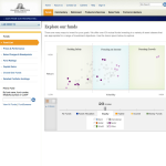
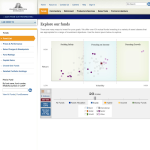
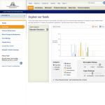
The final solution focused on allowing the advisor to easy filter funds according to key filtering criteria, as well as identify those part of the latest campaigns and highlight funds the advisor was already selling.
Overall User Experience Process
- Conduct industry competitive evaluation and comparative analysis
- Create conceptual design studies and visual design evolution studies
- Facilitate internal, multi-team work sessions
- Develop wireframes. Led by UX architect
- Present recommended designs to executive team
- Concept testing based on visual design prototypes
- Manage design-to-development build
- Usability testing with financial advisors
- Evaluate and present findings
- Identify future-state enhancements
