FRANKLIN TEMPLETON INVESTMENTS REDESIGN
Enhancing User Experience and Increasing Business Flexibility
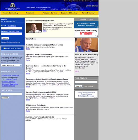
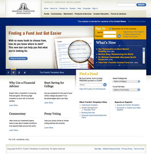
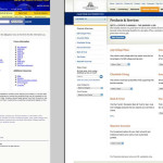
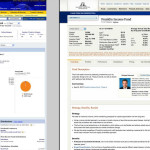
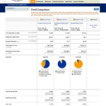
Franklin Templeton Investments set out to redesign its retail website for the first time since its inception. While the business had many goals, the main redesign objective was to evolve the visual presentation, information architecture, and existing CMS functionality to be reflective of business changes, current customer needs and the competitive market. Plus, the company used the opportunity to modernize its corporate brand.
The final aspect of the redesign was to extend the newly established platform, templates, and brand to the company’s 35 unique country specific websites and create a global, corporate website. This was to better maintain the company’s global brand while allowing regional offices to localize their content.
Overall User Experience Process
- Internal, multi-team work sessions. Participated in brainstorm session designed to expand existing site product tools and functionality.
- Wireframes. Led by UX architect, participated in concept brainstorm sessions and revisions.
- Art direction of agency brand explorations
- Visual design evolution of brand explorations to site flows. Led visual design discussions, visual direction, client presentations and design-to-development presentation build.
- Translation and application of design to international websites.
- Usability testing of key redesigned pages
[twentytwenty]
[/twentytwenty]

