NORTON ZONE SHARE
Finding Simplicity and Ensuring Clarity
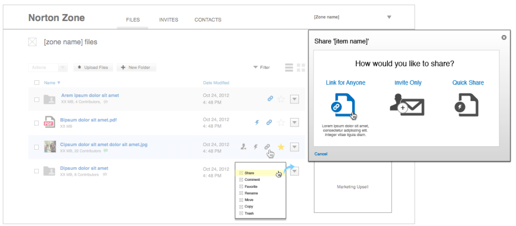
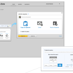
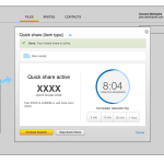
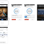
Norton Zone was a sync-n-share product that spanned both the enterprise and consumer space. It’s goal was to provide an elegant and simple solution to collaboration. The core task for both audiences was for user’s to share content with others; something that over time proved to be more challenging than expected.
UX research highlighted that both enterprise and consumers users alike did not understand the nuances their collaborations; were they giving someone access to not only view but edit their content or were they letting people look but not touch? Overtime, the team realized that both visual cues and clear language would be equally important in bringing clarity and understanding.
Overall User Experience Process
- Competitive analysis
- Usability testing
- User interviews
- Presentation of research findings
- Wireframes
- Interaction language


