Voice of Customer
Ongoing Discovery and Tracking Trends
Franklin Templeton Investments has a dedicated voice of customer (VoC) systems that documents inbound customer comments. However, these systems primary analysis focuses on the transfer agent and sales side of the business, not necessarily the web experience.
To gain insight into this area, the User Experience team created a repository of web related TA and sales VoC comments. The team then coupled these with internal user experience research (interviews, focus groups, survey statements, feedback comments).
Having one centralized location for multiple sources allowed the team a high-level view to track customer trends, identify enhancements, inform projects on user priorities, and determine areas where future research was needed. Also, it served to be a great resource to help educate internal business partners on the companies customers and clarify internal assumptions on user needs.
Overall User Experience Process
- Establish Sharepoint centralized repository for multiple VoC sources
- Coordinate resource effort to enter in source data
- Evaluate and tag customer comments and issues
- Identify and visualize long-term trends and monthly volume of customer themes
- Gather examples to support and inform future-state enhancements and projects
Contact
Résumé
Employment
PAYPAL.com
Senior Visual Design Consultant 5/2011 to Present
- Establishing visual design directions
- Product visionary roadmap concepting
- Collaborative brainstorming for user flows and online experiences
- Domain and technology researching
FRANKLIN TEMPLETON INVESTMENTS
Senior User Experience Designer 7/2005 to 4/2011 | Visual Designer 2/2001 to 6/2005
Art Direction and Design
- Manage visual design for over 35 corporate websites in 13 languages, web-based enterprise applications, intranets and styleguides
- Lead creative development, including template creation and visual execution of global site redesigns and new content templates
- Effectively integrate user experience disciplines and facilitate intra-team collaboration to translate user goals and business requirements into intuitive design solutions
- Ensure support and translation of corporate brand and product strategies for external and internal web initiatives
- Lead design UAT for site build issue tracking and resolution
- Provide design direction, business perspective and insight, guidance and mentorship to global team of senior, junior and contract designers
User Experience Research
- Conduct client interviews to build corporate knowledge base on customer activities
- Conduct expert reviews of website to identify usability issues and enhancement opportunities
- Generate Mental Models as part of project discovery and proposals
- Participate in team lead usability studies and document observations
- Track VoC user experience trends to determine actionable design solutions to enhance website experiences
- Evaluate user needs against business goals and development feasibility to determine project initiative priorities
Strategic Planning
- Analyze opportunities and project knowledge gaps, define successful approaches and proactively solve problems within design project lifecycle
- Concept design initiatives to address business and online challenges
Project Management
- Manage team design project work-flow, schedules, scope, timelines and deliverables
- Provide clear communication to business partners and management regarding project status, resource requirements, design issues and priorities
- Mitigate project risks and ensure timely resolution of key design issues
- Lead and collaboratively participate in key project-decision making; e.g. requirements gathering, resource allocation and coordination of global project teams
- Conduct vendor/agency evaluations for large scale project participation and long-term corporate relationship fit
Process Optimization
- Documentation of team design processes, job roles, responsibilities and training procedure
- Streamline design-to-development review process across global team, contractors, vendors and internal developers.
Relationship Management
- Directly manage client relationships in support of strategic and creative goals for both the US and international markets; e.g. Europe, Asia, North America
- Create, facilitate and lead client presentations and meetings
- Demonstrate sensitivity and awareness to the cultural and business environments of global business partners
Resource Management
- Define priorities and manage resources as appropriate across projects
- Manage, schedule, assign visual design and information architect production requests
EVITE.com
Designer 2/2000 to 11/2000 | Jr. Designer 9/1999 to 1/2000
- Successfully launched redesign of Evite invitation
- Established site visual design and developed standards
- Collaboratively developed ongoing site UI, site promotions and product enhancements from concept to launch
- Actively assisted in building design team
- Led creation of designs for user testing and collaboratively organized focus groups
Awards
KASINA TOP TEN FINANCIAL WEBSITES
FranklinTempleton.com
2001, 2002, 2003, 2004, 2005, 2006, 2007, 2008, 2009. 2010
STAR AWARDS, Mutual Fund Education Alliance
FranklinTempleton.com
– 2010 Best Retail Website (US)
– 2010 Best Online Marketing Campaign Advisor – 2020 Vision: Equities in the Decades Ahead
– 2007 Honorable Mention, Best Electronic Advisor Newsletter
WEBBY AWARD, BEST SERVICE
Evite.com
2001
Lectures, Conferences & Seminars
Unconference, Focus on Presentations
Palo Alto, February 2009
UI 12
Boston, November 2007
WEB DESIGN WORLD
San Francisco, January 2007
USABILITY WEEK, NEILSEN NORMAN GROUP
Accessiblity Focus
San Francisco, January 2004
LECTURES, DISCUSSION GROUPS
Active participant of the AIGA and Bay Area design community
2002 to present
Education
University of California, Santa Barbara
BA History, 1994 – 1999
University of Sevilla, Spain
Abroad studies, History 1997 – 1998
References
Available upon request
Photos
{loadposition user1}
Conceptual Work
|
|
Riley |
|
Spoken words draw me inFill my spirit and feed my pathJuxtaposed with image, they speak truth |
||
|
Riley has been writing since she picked up her first pencil. However, she didn’t truly know expression until a metamorphic trip thru the back countries of South America. Riley emerged with the knowledge that life is the true teacher and she the eternal student. |
||
Language with no Phonetic Variance |
Additional Work
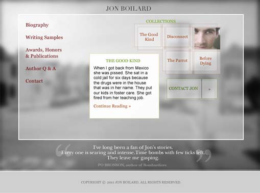
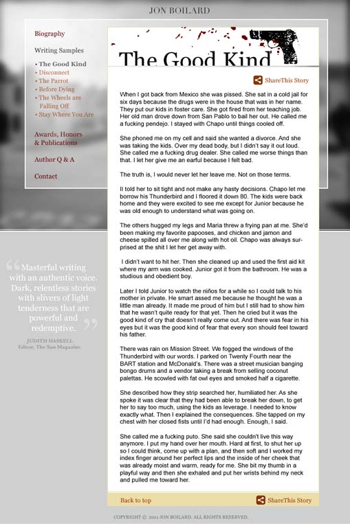
Jon Boilard, Author Website

![]()
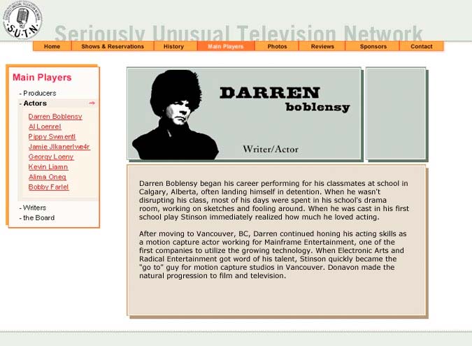
Seriously Unusual Television Network

![]()
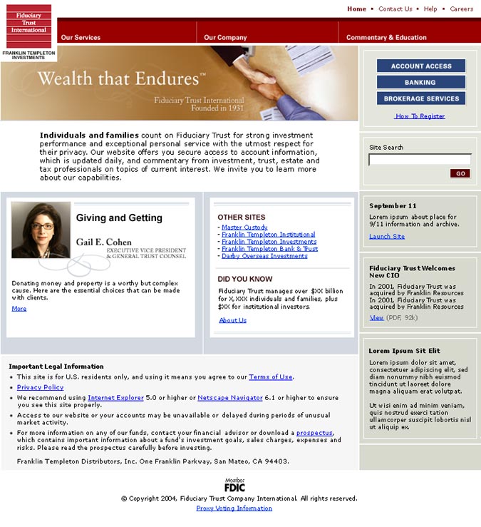
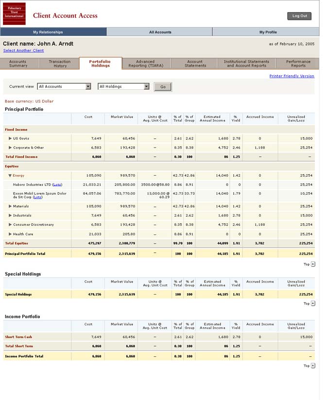
Fiduciary Trust
Mixed Media
Circle
{besps}slideshowImages/may08Details{/besps}
![]()
Girl
{besps}slideshowImages/girl{/besps}
![]()
Square
{besps}slideshowImages/jul08InProgress{/besps}
![]()
Blue
{besps}slideshowImages/aug08InProgress{/besps}
![]()
Bird Volume I
{besps}slideshowImages/feb08{/besps}
![]()
Bird Volume II
{besps}slideshowImages/bird08InProgress{/besps}
![]()
Circle II
{besps}slideshowImages/aug09Details{/besps}
Identity






Paper
